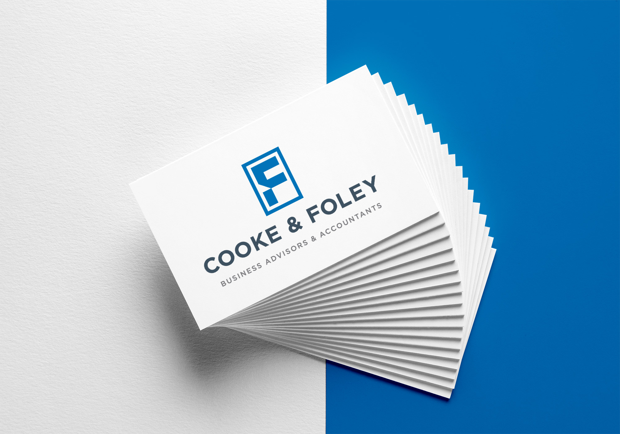
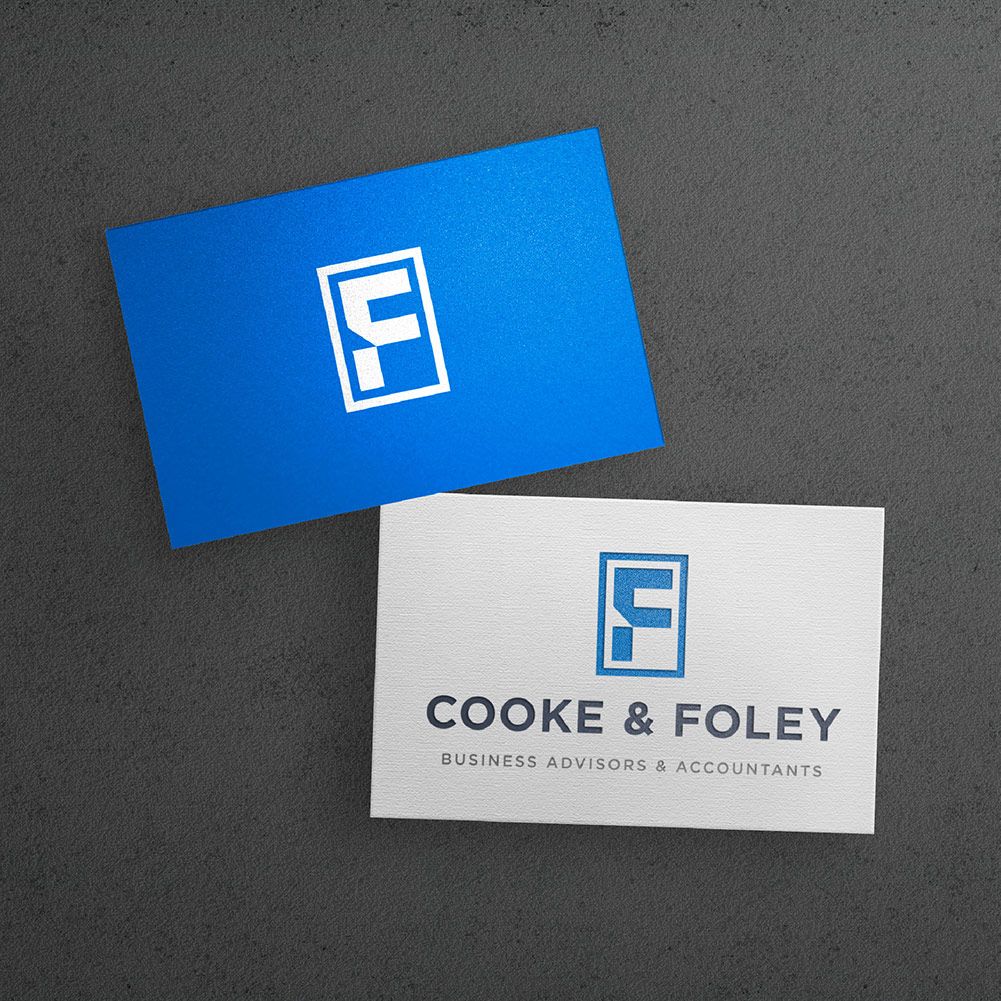

Our goal was to build a new visual identity that is able to establish Cooke & Foley as a brand that is perceived as fresh, sharp and dependable.
After engaging a local designer, Cooke & Foley engaged The Impression Creative for their rebrand. Cooke & Foley were struggling to come up with an effective design with their current designer. After taking over the project, we were able to develop a strong concept and brand mark. The brandmark features a strong, square structure, utilising the C and F initials to create a bold and unique brand-mark. The square nature of this brand-mark elicits stability and balance further evoking a sense of dependability in the logo. Interrupting the square structure is a triangular slice, which is inspired by the brand’s core value of innovation and speciality in strategic direction services. The bold stature of the brand-mark makes it easily recognisable and unique to the brand whilst also remaining versatile and adaptable for the brand’s niches.
September 8, 2020