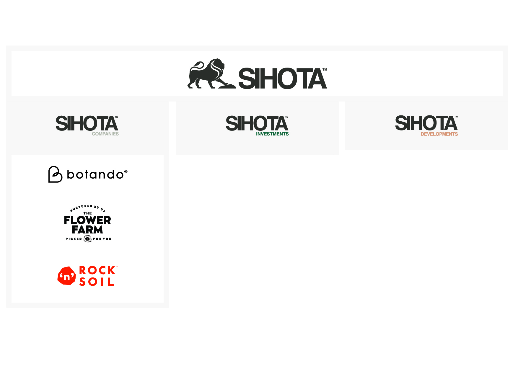
The Sihota story started in 1978 when Tarsem Sihota moved from India to Brisbane, acquiring 5 acres of land and establishing it as his farm and first business venture in Australia. Since then, this business from humble roots has sprouted, and grown and now includes a group of businesses and a plethora of residential, commercial, industrial and agricultural investments. Despite its scale, the Group had no branding and no logo which presented a unique opportunity for The Impression to partner with Sihota to brand the group.
From the discovery workshop, we uncovered the origins of the Sihota family, connecting back to the Punjab region which inspires so much of the purpose and vision of the group to this day. We uncovered 3 integral elements; the lion, the Jat and the land. The Jats are the countrymen of the Punjab Region. They built their legacy from hard work, integrity and devotion to the land which itself has been at the core of the Sihota Group’s endeavours. The Lion inspires bravery and integrity and is also connected to the Sikh Jats who were the warriors and protectors of the land.
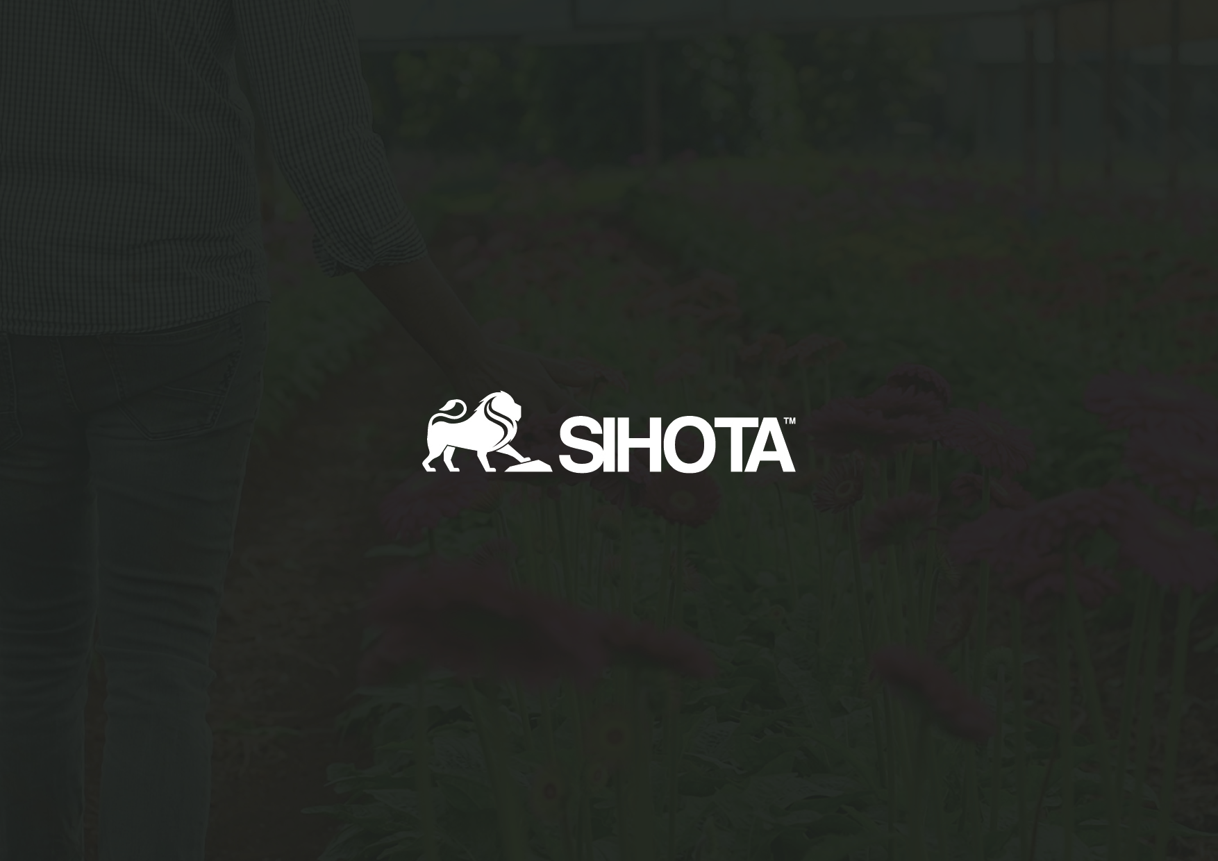
The brand mark needed to be inspired by the devotion to the land but represent the commitment to moving forward, innovating and progressing. Here, the Sihota Lion and brand mark were born.
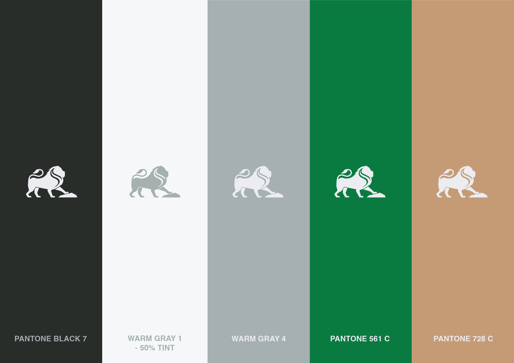
The lion is inspired by the people and the origins of the Sihota family, whilst also conveying bravery, integrity and stature. The rock represents the Sihota groups enduring devotion to the land. It grounds them and gives them standing whilst also laying the platform to strive forward. Not only is the lion being grounded by the rock, but he is using it to push forward, evidencing the Sihota Groups’ pursuit of excellence. At the core of all of this is the Sihota ’S’, stamped at the heart of the Lion, representing the values of the Sihota family showing through.
We paired the brand mark with a grounded colour palette, inspired by the agricultural origins of the group and its operations. The warm grey and orange are the rock and soil, which represents the foundation and roots of the group whilst also connecting to Rock ’N’ Soil, one of the foundation companies in the Sihota Group. The green is the foliage and the vegetation, representing the growth and innovation in the company whilst also linking to the Flower Farm, the original foundation company of the Sihota Group. We developed the tagline “A trusted Legacy, A visionary future”, which aims to acknowledge the origins and roots of the group whilst also aspiring for growth and innovation.
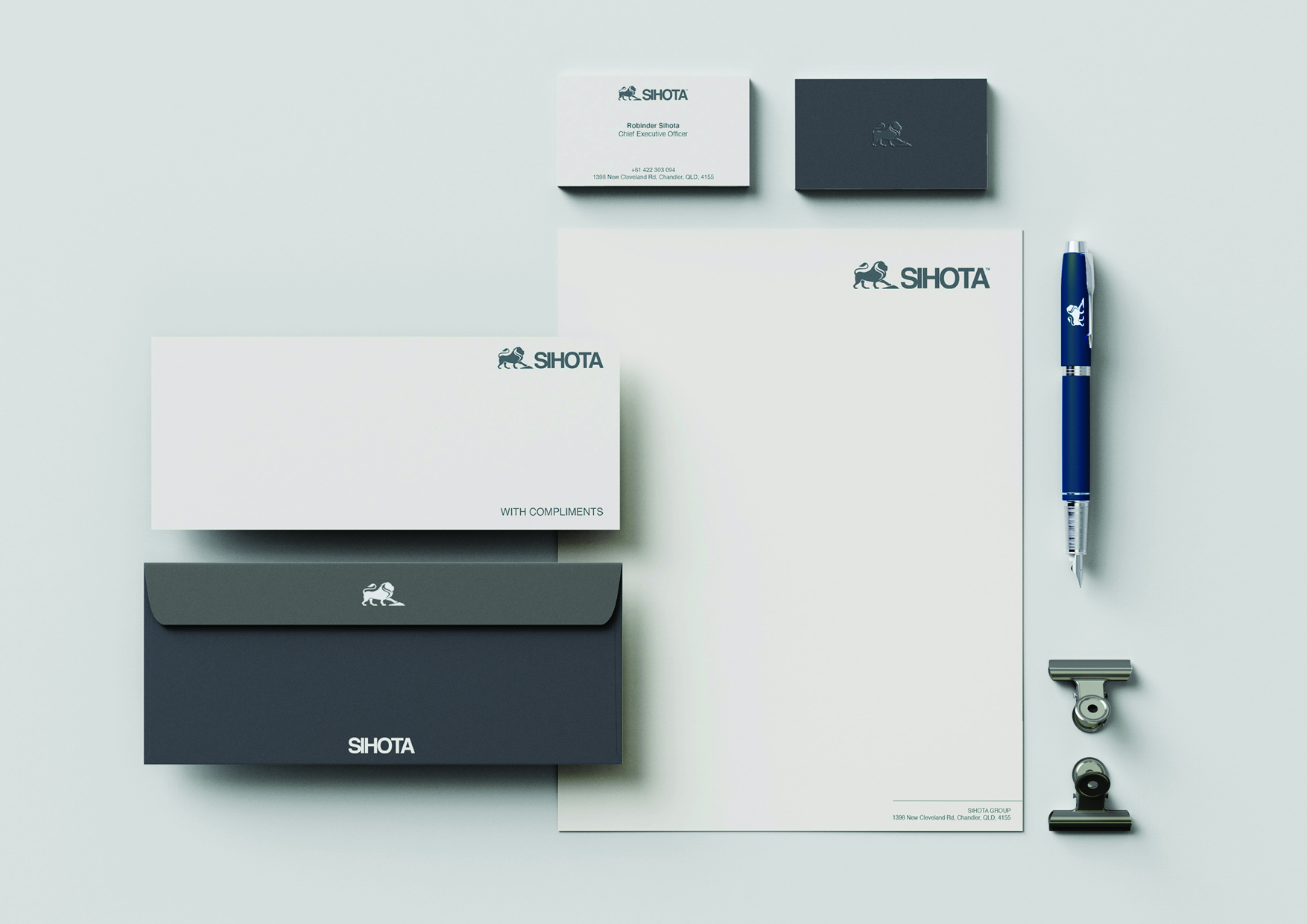
We have been able to create a unique, strong and memorable brand that encapsulates the origins, mission and vision of the Sihota Group which will serve as a vehicle as the brand strives toward a visionary future.